Company logo
The main logo for Steph Connell Productions: press, production and key materials.
The rulebook.
Big ideas. Small human stories. Told in surprising ways. This page is everything you need to make something look and sound like Steph: the logos, the colours, the type, the scribbles and the building blocks of the site.
Two names share one look. Steph Connell, producer, is the handwritten signature. Steph Connell Productions is the condensed capitals.
SVG, outlined, so no fonts are needed to use them.
The main logo for Steph Connell Productions: press, production and key materials.
For Steph as a producer: the website header, bios, programmes and production credits.
A compact mark for social avatars, watermarks or anywhere space is tight.
The same signature with the flourish in another brand colour. It marks a Steph Connell Productions show on the site: pick the flourish that stands out from whatever sits behind it.
Keep clear space around every logo at least the height of the S. The SVGs are cropped tight, so add it yourself.
Colour on cream or white. Reversed on ink, black or a dark photograph. One colour when the brush stroke would fight the background, or for single-colour print.
Colour frames the work, never the text.
#FF8780--coralPrimary accent. Buttons, scribbles, highlights.
#C0EE81--greenPrimary accent. Bands, logo flourishes.
#FCCAC5--pinkSupporting. Bands and cards.
#FFC279--orangeSupporting. Bands and cards.
#1F1C19--on-fillAll text, on cream and on colour.
#FBF6EE--bgThe page background.
A warm, optimistic palette that feels creative, human and energetic. Coral and green lead, pink and orange support. Text is ink, including on colour. The one exception is handwriting, which can be coral.
#B23F2E--coral-inkSmall handwriting, errors and focus rings, where coral is too pale to read.
#5D544C--ink-2Captions and supporting notes.
#E0D4C3--lineHairlines between rows.
#E3F3C2--green-tintThe pale band behind artist development.
#2A2420--stageBehind photos while they load.
Headings · Barlow Condensed ExtraBold, capitals
Big ideas.
Small human stories.
Told in surprising ways
Connecting people, places and stories through theatre
Body · Source Sans 3
We make ambitious, imaginative theatre that brings people, places and stories together, told in surprising ways.
Body copy is 17px on a 1.7 line height, never wider than 68 characters. Plain words, short sentences, first person.
Captions and supporting notes sit in the softer ink.
Handwriting · Golden Hopes
a little note…
Steph's voice in the margins. One short line at a time, slightly tilted, never for body copy or anything people need to read twice.
The rules every page is built on.
Twelve columns, never wider than 1312px, with 16 to 48px of space at the sides. Columns drop to one on phones.
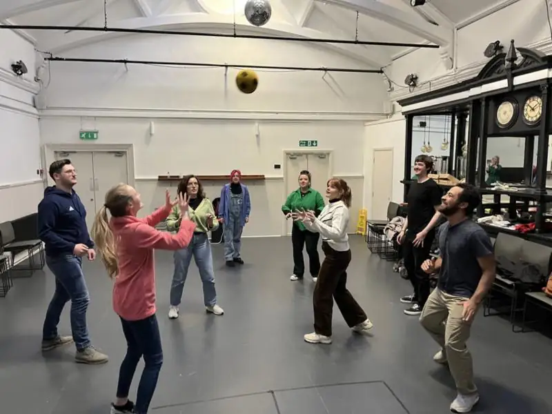
Landscape 3:2 photos in a thick colour frame with 12px corners. Captions sit bottom left.
Green, orange and coral stripes open the footer on every page.
Page title
Nice to meet you.
Every page opens with a coloured band and its title, then a handwritten hello beside a short introduction.
Big ideas through small human stories.
One per page at most, to break up the grid.
All 12 scribbles from Steph's brand pack, numbered as in the source files. They come in coral, green, orange and pink. Keep them small and use one at a time, to point at something, circle it or give it a little sparkle.
123456789101112Coral Green Pink Orange
Underline one word or phrase in a heading. On a coloured band the stroke turns cream.
Use them to emphasise a key message, a title or a navigation element. One or two a screen. Keep it intentional and avoid overuse.
How the pieces come together on a project card and a poster.
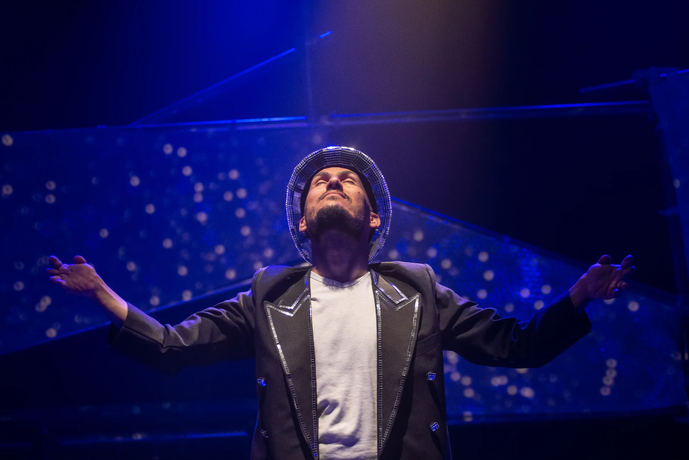
Featured production
Told in surprising ways.
Photograph first. A cream panel cut into the corner carries a small label and a condensed title, with one coral stroke under it.
Big ideas.
Small human
stories.
Told in
surprising ways.
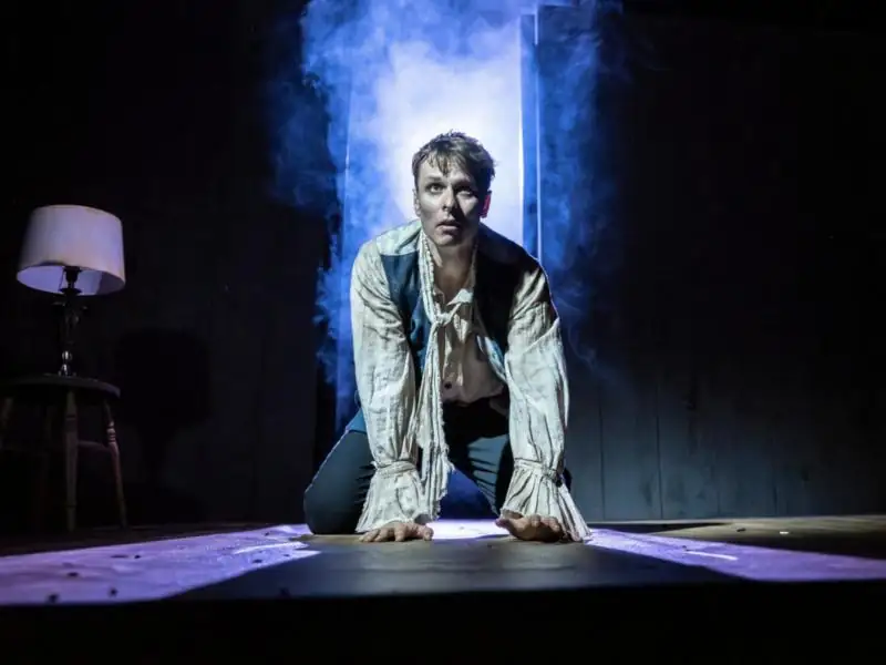
Full-bleed production photograph, cream type set straight onto it, the reversed company logo bottom left and one small mark for energy.
The building blocks used across the pages. Sample wording throughout.
Used on the Work and home pages. The frame takes the show's colour, and the SCP signature marks a Steph Connell Productions show.
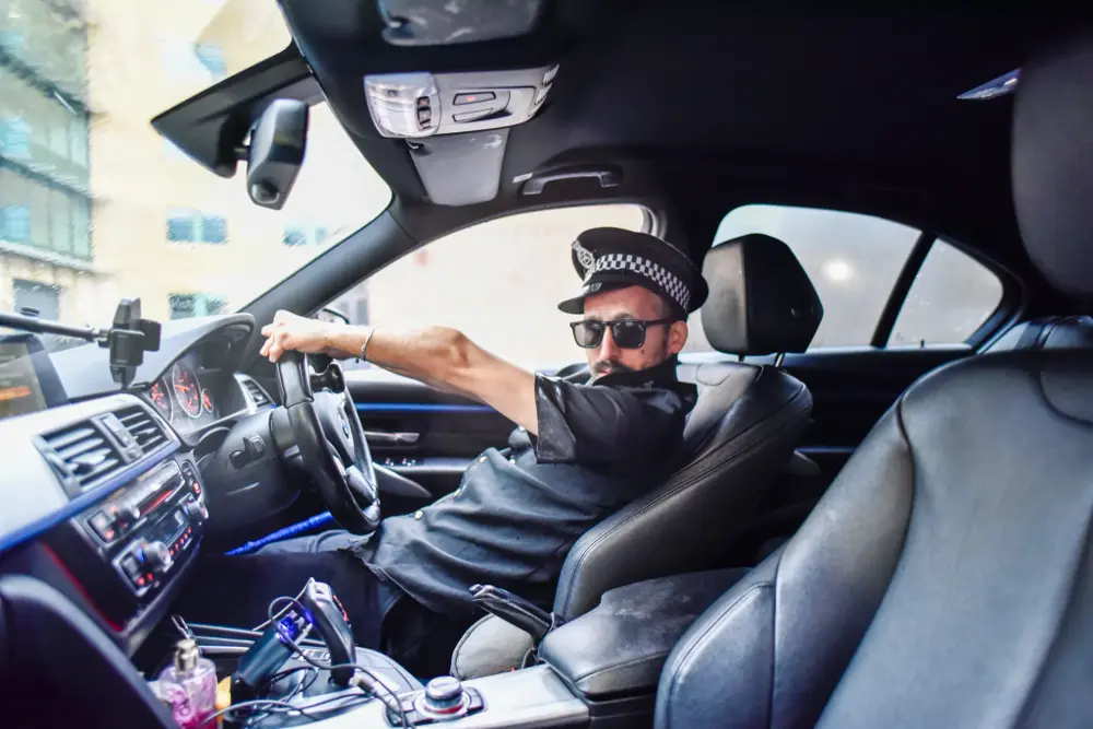
The Productions page shows every date still to come. The handwritten note is optional.
The home page shows the next three dates.
A short handwritten line
A short handwritten line
A short handwritten line
Home page. Each note keeps its colour and tilt, so changing the words never changes the look.
Plan
A handwritten tagline
Fund
A handwritten tagline
What happens at this stage.
What happens at this stage.
What happens at this stage.
What happens at this stage.
One or two sentences on how this shows up in the work.
One or two sentences on how this shows up in the work.
One or two sentences on how this shows up in the work.
A handwritten line
Section heading
A short introduction to this offer.
What the programme offers.
What the programme offers.
A short quote from someone Steph has worked with.
A short quote from someone Steph has worked with.
A short quote from someone Steph has worked with.
Partner name Partner name Partner name Partner name
Thanks message
Shown in place of the form once it has been sent.
What shows up when a page is shared on social media or in a message.
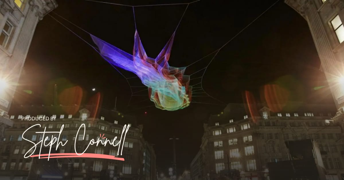
1200 × 630 pixels: a production photograph, darkened towards the bottom, with the reversed Produced by Steph Connell logo bottom left. Every page shares it, except show pages, which share their own production photo and its description.
To change the photo, go to Site settings → Share image in the admin. The crop, shading and logo are added automatically when the site is published.
The pieces a show page is built from. Each one only appears when the show has something to put in it.
Tickets lead in coral. The trailer, tour pack and impact report follow in outline. The trailer opens a YouTube link in a popup.
With roles, a two-column list. With no roles filled in (an ensemble), the names run on one line, split by coral slashes.
Job on the left, name on the right.
The result sits in an orange tag beside the award.
A simple list for past work with no individual dates, in the same size as the body text.
One line in Steph's own words.Steph
Handwritten and signed, under the write-up.
| Date | Venue | Access | Tickets |
|---|---|---|---|
| 9–12 Jun 2027 | Live Theatre Newcastle | CaptionedBSL | Book tickets |
| Thu 17 Jun 2027 | Leeds Playhouse Leeds | – | On sale soon |
| Sat 3 Oct 2026 | Tron Theatre Glasgow | Relaxed | Past |
More dates to be announced soon
Tickets are sold by each venue. Running time 75 minutes.
One row per venue. A run shows as a range, and a single night keeps its weekday. With a ticket link a date shows a button, without one it shows On sale soon, and it changes to Past by itself. The handwritten note and ticket notes sit underneath.
Extra production photos in the same framed tiles as the Work page, with the frame in the show's colour. Tiles are cropped to landscape, and selecting one opens the whole photo. A last row that doesn't fill up sits in the middle.
Funny, tender and toe-curling.
A road-trip movie of a play.
The numbers and reviews get their own band, in the next colour round from the band at the top of the page. Stars are optional: a review without them just shows the quote.
Creative theatre that connects people. Write the way Steph talks: like a person, over a cup of tea.
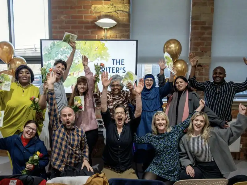
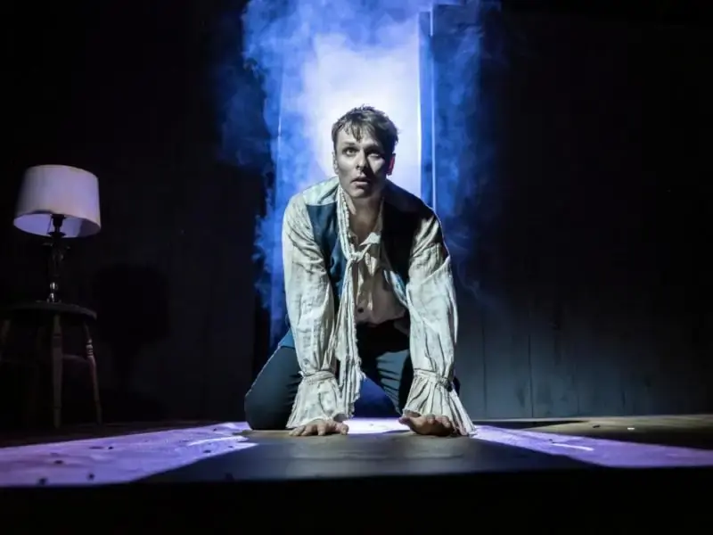
Vivid, authentic production photography. Movement, music, texture, humanity and transformation. Images should feel real to each production.